Is Print
Font size in books and examinations,controlling the academic achievement of
most people?
More
evidence from a primary school
I have been struggling with how to approach this post. In
previous posts I have referred to the issue of font size and the limitations it
places on a person’s language/reading performance and development.
The work of my colleagues with dyslexic university
students and mine with further education students has given us a clear, simple
method of measuring the optimal font size of a person. For the dyslexic undergraduates this surprised
us as being a mean optimal font size of
18 after any intervention with ophthalmology.
For the FE students it was again the major easily
adjustable factor controlling their
reading performance.
With the Primary school pupils studied last year the
outcomes were in many ways quite astounding.
This was a primary school which had an above average
intake to start with. I will summarise the outcomes.
For a year 5 class:
The average optimal font needed was 24.6
The average optimal font needed was 24.6
Over two thirds of the pupils needed a font size greater than 18.
Over two thirds of the pupils needed a font size greater than 18
Ok... the word need
is crucial here. These pupils could read fonts that were smaller. But their performance was (
significantly) poorer. So let me make that clear. At smaller ( or larger) fonts
than their optimal sizes, they would take longer to read a piece of text and get more tired/stressed doing so. They would
probably be less willing/motivated to undertake extensive reading.
(Reading development is dependent on the total reading
experience; positive feedback from the number of words and the
richness/complexity of the experience.)
The word read is
also crucial here.
This was reading simple, unchallenging text for these pupils.
This was a measure of the ability of their ‘systems’
ability to collect visual data and convert it into sounds /phonological
output.
The reading speed was not a measure of …
… any intellectual capability;
or
… how much they
had read before.
So what really was being considered here was what effect
the font size of text was controlling the phonological output of the pupils.
Each pupil had a reading speed measured using a default
size of 13.
Reading speed was then measured for each pupil at a range
of font sizes and the optimal size was recorded.
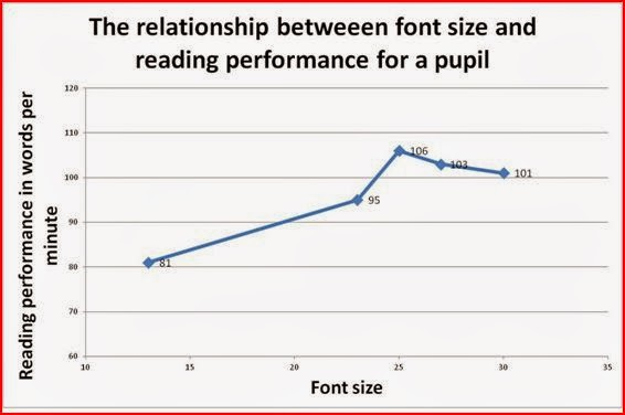
The graph below is typical of the response of most pupils
to changing the font size. What varies of course are the speeds and the
fonts. In this case the difference in
performance of optimising the font size
was a 31% increase in performance.
At a default of 13, this pupil , with no apparent visual problems was going to
be a reluctant reader, not for any sociological, home, economic reason, but
simply because it was too slow to be enjoyable, too slow to remember/
understand what they had read, and probably because it was so uncomfortable.
Or perhaps I should say….
it was, too slow to remember as much as they could have/
understand as much as they could have what they had read, and probably because
it was so uncomfortable as a consequence it was too slow to be as enjoyable as it
could be.
This would likely impact on the motivation and attitude
to studying of any pupil. The more we enjoy an activity the more likely we are
to repeat it.
In the days before computers they would have been
condemned to believing they were not very clever, possibly a bit stupid. Even
if they knew they were not, they would have been told they were by society.
They would have been excluded by the people who could read. Not intentionally,
but by ‘default’. With a device such as a’ Kindle’, this pupil and in fact the
majority would be able to adjust the font size to what works for them. But they
would need assistance to understand what could be.. We all tend to accept our
own experience as ‘normal’. We need it to be seen as ‘normal’ that we use a
font size that works for us in the same way as we wear shoes that fir our feet!
In my generation and really until the later 1990’s, less
than 20 years ago with the Word for Windows and similar programmes, there was
no choice. The people who ran the show
were the people who could read effectively using small fonts, and they would
see small fonts as ‘normal’.
In a strange way, large fonts were those associated with
low intelligence, laziness. In a similar way those who wrote in a ‘large style’
(because they needed to?) were also seen and treated as educational
also-runs/failures. I can remember
friends of mine who could not ‘keep between the lines’ in their notebooks and
were made to feel stupid by their teachers. It is likely that a person who
writes with a larger font also needs to read with a larger font.
In secondary schools, the fonts in books, exams and
worksheets were all small; too small for the majority to thrive. The hierarchical culture of our society has
been supported by the acceptance of a relationship between reading small fonts
and academic success. At university level
, the texts have even smaller fonts than at school.
In my own early work, using colour background, I accepted
these assumptions, unwittingly I had like most researchers been brought up in a
world where the font sizes were fixed.
Indeed the development of research and models in dyslexia and reading
difficulties developed in these conditions.
Spectacles were about getting sufficient acuity to read
the fonts in the books and examinations.
If you still had difficulty then you had a ’visual disability’ or in my
school days ‘just not very clever’. What the work I have done tells me is that
changing the font sizes and conditions changes the speed at which the text is
processed. It also appears to change the speed at which the system is able to
discriminate between adjacent letters in a word or adjacent words in a sentence;
referred to as ‘crowding’.
The
post below is possibly the most important one in the last couple of years. It
discusses the most thought provoking day I have had in the study of ‘reading’.
It considers the way the visual system is operating during the first few
milliseconds of a fixation, when the eye has just started to collect visual
data. Have a read and see if you understand what I am trying to explain.
I
am wondering whether this font issue will really be taken up by schools and
society. I know that the school which
did the study is going to get their SATS printed in larger fonts for its pupils
and provide notepads which allow the pupils to use a suitable font.
What
about the rest of the world?
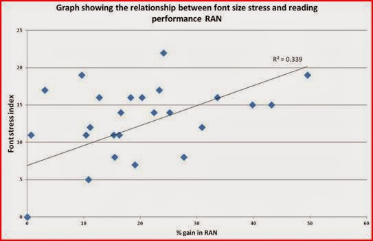
As
a final point the graph below shows the relationship between what I have called
‘the font stress index’ of each pupil and the proportionate benefit in reading
performance they gain from using the correct font size.
The
font size index is the difference between the font they optimise on and the
default size of 13 point.
The
R squared value suggests that 58% of the
variation in reading performance in the group could be attributable to the font
size thay are having to use.